Mobile Online Payment · Case Study
Binding Bank Cards (Credit Cards) and Paying
Bank card payment is the most mainstream and common payment method in Western markets. From a user perception standpoint, card binding behaves very similarly across platforms (wallets, e-commerce), and the process is relatively simple. On most platforms, paying by bank card is the default (or first) option. I selected several mainstream platforms for further observation.
Both Apple Pay and Google Pay support adding bank cards, but since neither allows adding cards during the checkout process, they are not included in this section.
Uber Eats
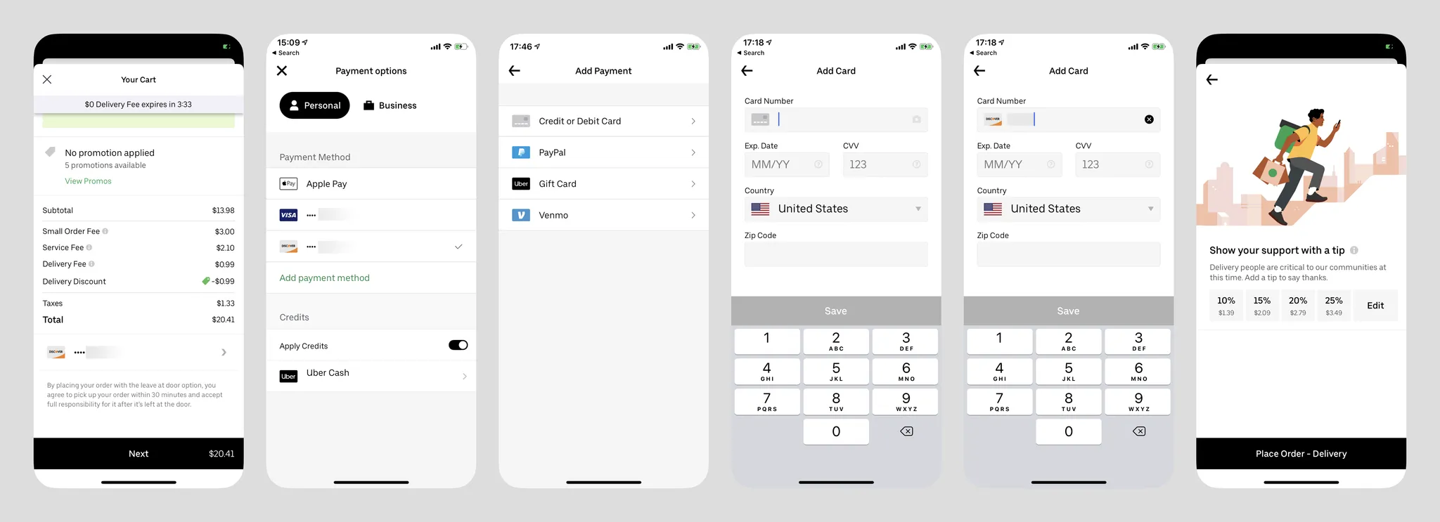
- Card option is listed first;
- Cards can be added via photo scanning;
- Has card BIN recognition (also auto-sets security code length);
- On the card info input page, the cursor auto-advances from expiry date to CVV, then to Zip Code, but not after entering the card number;
- Non-standard card numbers trigger a warning (image below);
- This section doesn't require cardholder name or Billing Address, possibly extracted from user info? What about someone else's card (e.g., spouse)?
- The page title says "Add Card" but the button says "SAVE" (likely reusing the same interface as direct card addition);
- Tapping the question mark shows expiry date and CVV guidance, but users must tap OK to dismiss it — tapping the gray area above doesn't work;
- Recently updated — now forces users to set a tip (last image).
Target (Supermarket)
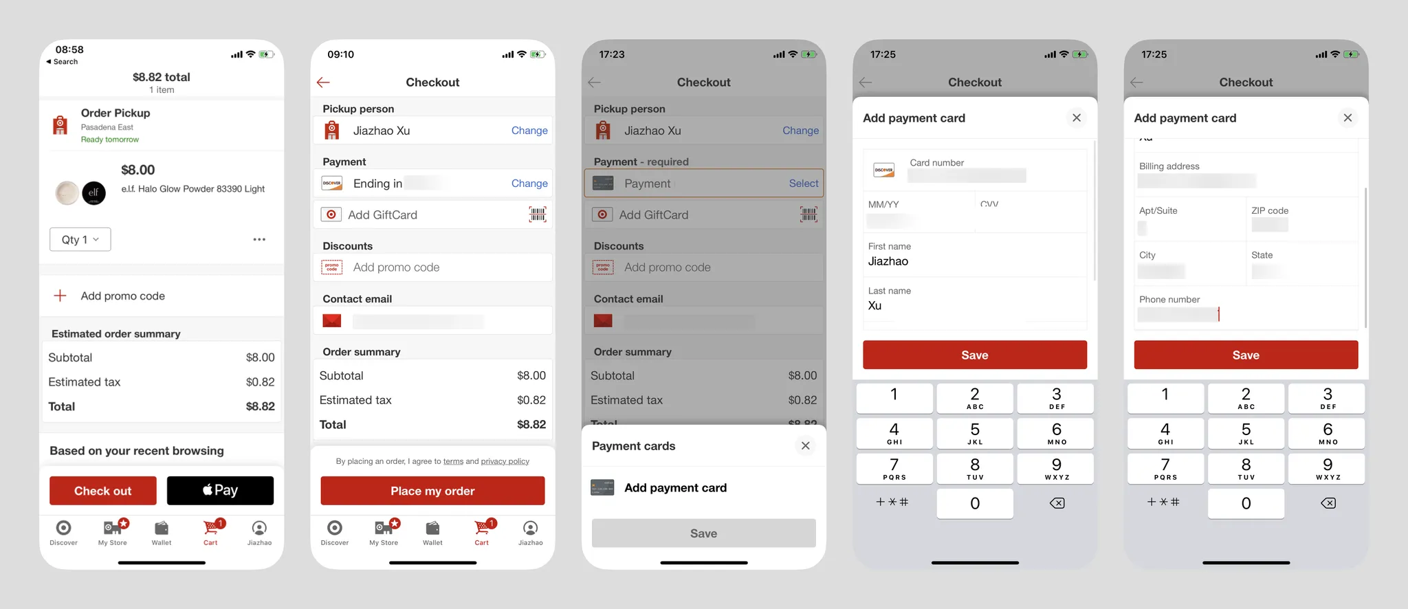
- On the first screen, after tapping Select, if the user hasn't bound a card they can tap "Add payment card" (redundant gray save button). If cards exist, they can choose from multiple bound cards. Can new users directly Add payment card?
- Payment methods only support cards, or users can pay with Apple Pay directly from the cart screen;
- Uses a bottom sheet slide-up form;
- Has card BIN recognition (also auto-sets security code length);
- Unlike Uber, requires cardholder name;
- Auto-advancing cursor works better than Uber Eats — also advances after entering 16-digit card number;
- The visible area is very small, but content includes card info and Billing Address with non-small font sizes, requiring internal scrolling;
- Button label is also "SAVE".
GrubHub (Food Delivery)
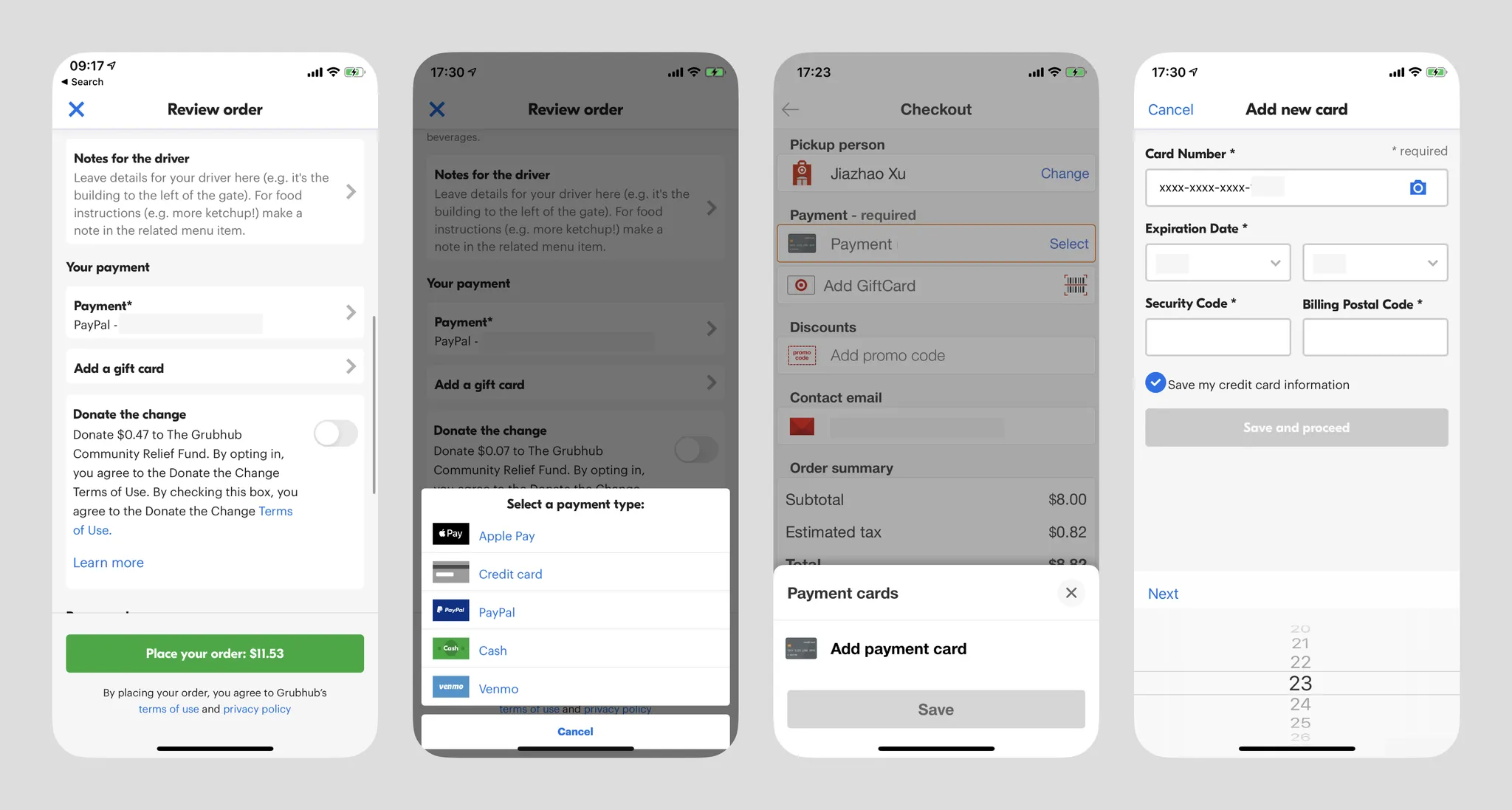
- Card info is masked after input;
- Date input using scroll wheels is very inconvenient;
- Button label "save and proceed" gives a "Moving Forward" feeling;
- The second screen is quite redundant;
- Cards can opt out of "Save my credit card information" for single use;
- The "required" reminder is somewhat puzzling — are there non-required sections? Though Western users may indeed need the hint.
Summary
In Western markets, adding bank card payment is the absolute mainstream, with some platforms supporting only card payments. Its advantage is eliminating all third-party login requirements, while its disadvantage is long card numbers — in most cases users need the physical card nearby to enter the number (scanning or manual input), and billing address info is also lengthy. For any wallet product, adding bank cards is an essential flow. If needed, the Target and Uber cases above are very valuable references — the interaction flow should be as brief as possible, requesting minimal information (see comparison below: selecting a payment channel and adding a payment channel can be merged into one interaction), and cardholder info and billing address should be obtained through other channels (e.g., platform accounts) whenever possible. Also assist users in entering information faster.
Outside Western markets, adding bank cards may require additional steps (such as cardholder phone number verification, etc.)
In Western markets, card binding shows no security environment indicators. I personally find this harmless — this convention may not exist in developing countries.
Binding Wallet Payment
PayPal on Walmart (New User)
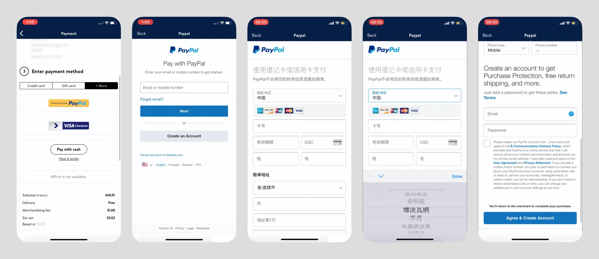
- Walmart's copy "Enter" is quite strange;
- PayPal is humbly placed in the "+More" section, likely because Walmart's primary users are lower-middle income Americans — having a credit card is already difficult, let alone wallet services;
- PayPal service is region-locked. It's unclear whether it checks the visitor's IP origin, but US and China accounts are not interoperable, and cross-border card addition is difficult (from personal experience, domestic Chinese Visa cards cannot be bound to US PayPal accounts);
- The footer always has a "Cancel and Return to Walmart.com" link, a very friendly detail (also revealing that Walmart's iOS App is likely a WebApp wrapper);
- PayPal asks new users for card info first, then account info, which is the opposite of PayPal's website logic, showing they've indeed adjusted the flow for checkout scenarios;
- Country/region is auto-selected based on IP, and different countries require different information — e.g., compared to the US, Chinese account registration also requires users to input legal ID documents (ID card, driver's license, or passport);
- Country selection is very unfriendly, just like their website's country selection page (https://www.paypal.com/welcome/signup/#/email_password) where 200 countries are dumped together, but the display language changes to follow the country selection;
PayPal on Walmart (Returning User)
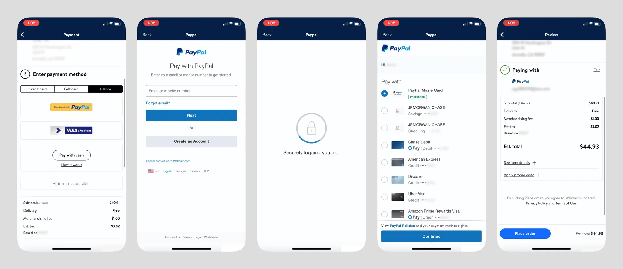
- When the login environment is secure, PayPal payment is quite fast — after entering credentials (if it's a repeat login, the email address can be remembered), it goes directly to the Pay with card/bank account list. At the bottom of this screen there's a Chase Credit Card promotion, and users can also add new payment methods;
- The "Cancel and return to Walmart.com" button is gone;
- Chase Pay logo informs users that using this card earns reward points;
- PayPal account persists within the Walmart App;
- After successful payment, PayPal App sends a payment success notification;
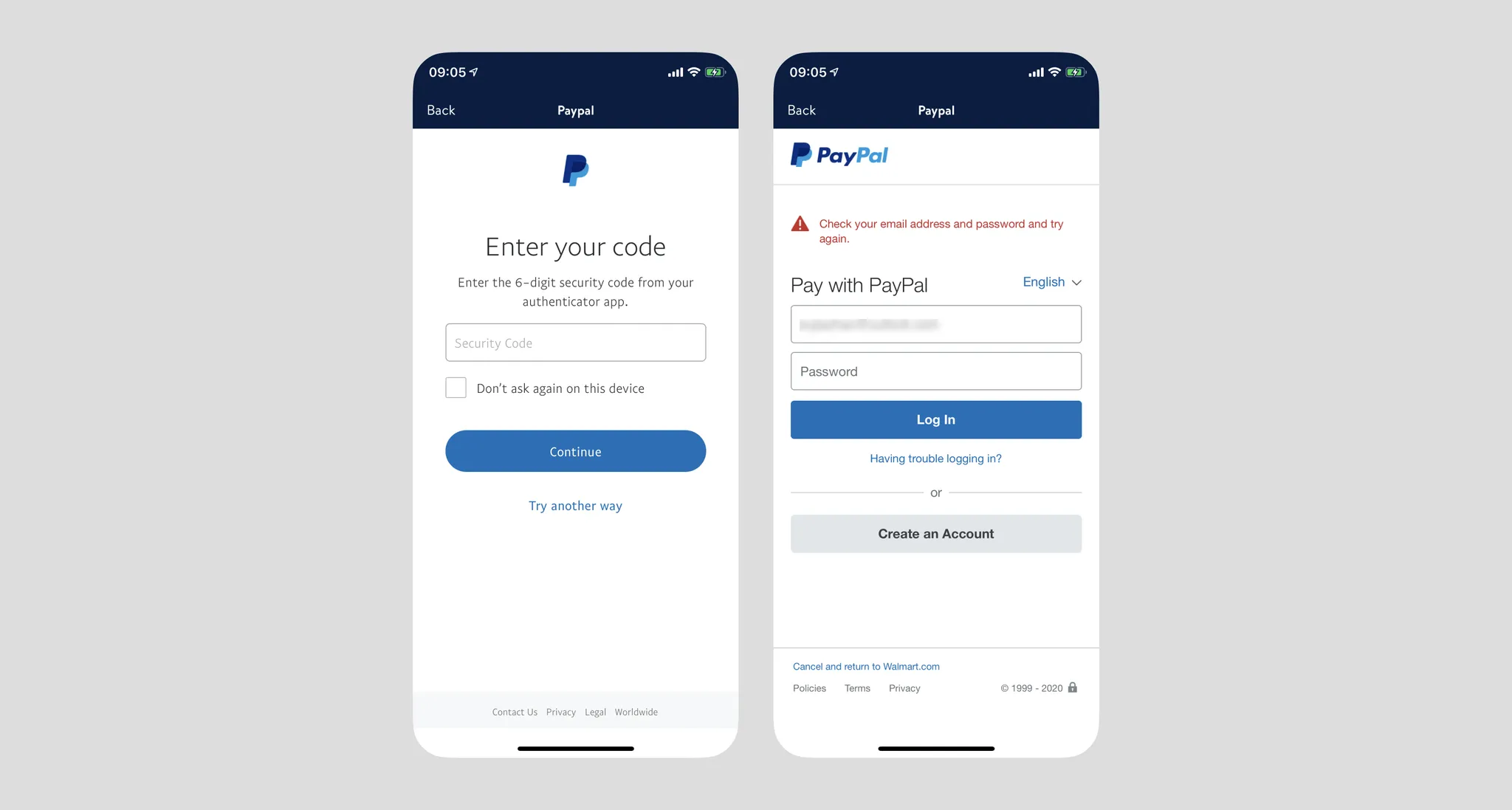
- When the account has two-factor authentication enabled, PayPal requires identity verification after login via SMS OTP or Authenticator. However, if the login environment is insecure (e.g., VPN, new IP), there's a chance of being unable to log in, getting stuck in a loop, ultimately failing payment with a terrible experience (see image below).
VISA Checkout on Walmart (New User)
VISA Checkout is an online payment channel provided by Visa. First, strangely, the VISA Checkout logo never appears throughout the process, contradicting their website copy: "Online buying is evolving. Now when you see this icon at any site that accepts Visa, you can enjoy an easy, smart and secure checkout experience."

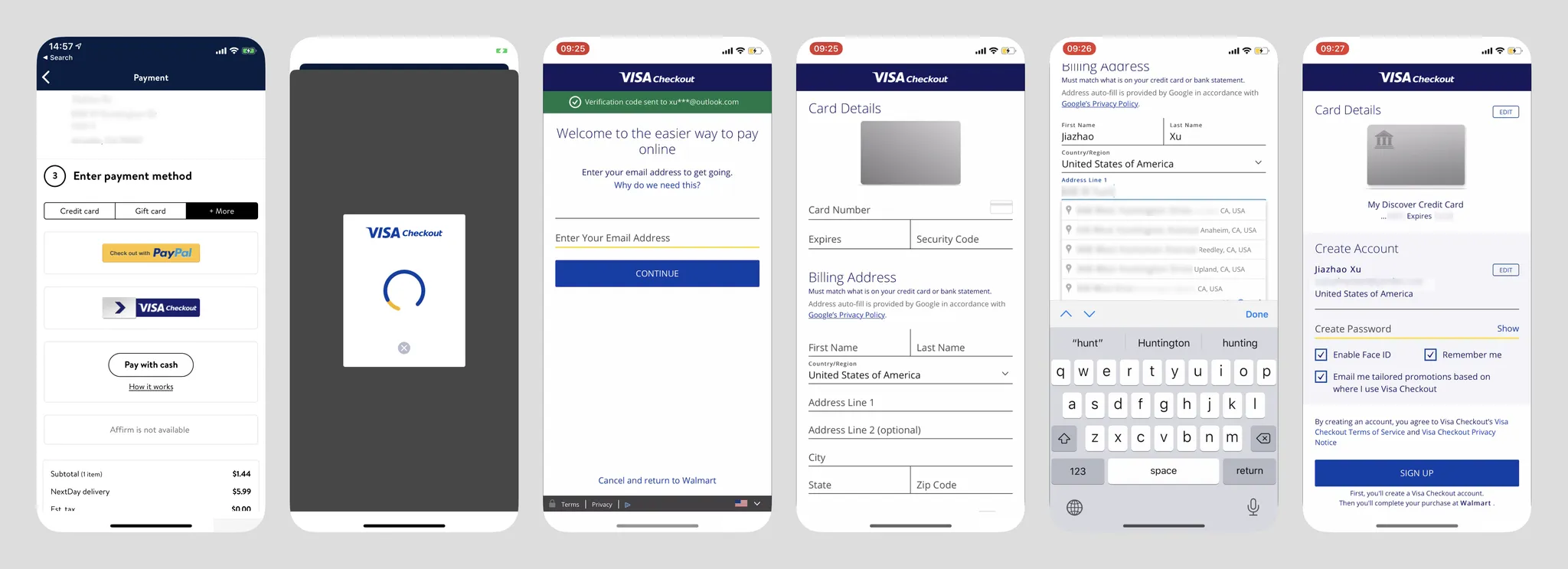
- VISA Checkout is also placed in "+More";
- After tapping the button, the loading screen refreshes twice, causing user confusion. After loading completes, the bottom sheet transforms into Walmart's in-app browser, breaking continuity;
- Without cached data, the interface goes directly to screen three, asking users to enter their email address directly, not distinguishing between new and returning users at this step — personally I think this logic is worth referencing;
- Bottom also has "Cancel and return to Walmart";
- Interface styling is rather odd — redundant lines and strange yellow lines, "online" is a widow word — OCD trigger;
- New users go to the card info screen after entering email. Following the standard flow, they need to add a bank card. The card addition interface is very conventional, with no input assistance except address autocomplete at the bottom. Address autocomplete is very convenient — one tap automatically fills in city, state, and zip code;
- After tapping Next, users are asked to create a password, but I tapped SIGN UP and the system froze — no response whatsoever. After a long wait, a "Service is unavailable" message appeared. Payment failed, and I couldn't return to Walmart — had to restart the app.
VISA Checkout on Walmart (Returning User)
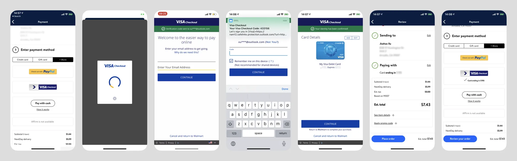
- After entering the login page, VISA immediately sends an email OTP to the user (without requiring user initiation), with a notification at the top. This works well when email services are fast, but with services like NetEase or AOL there may be delays. The system also auto-checks "Remember me on this device";
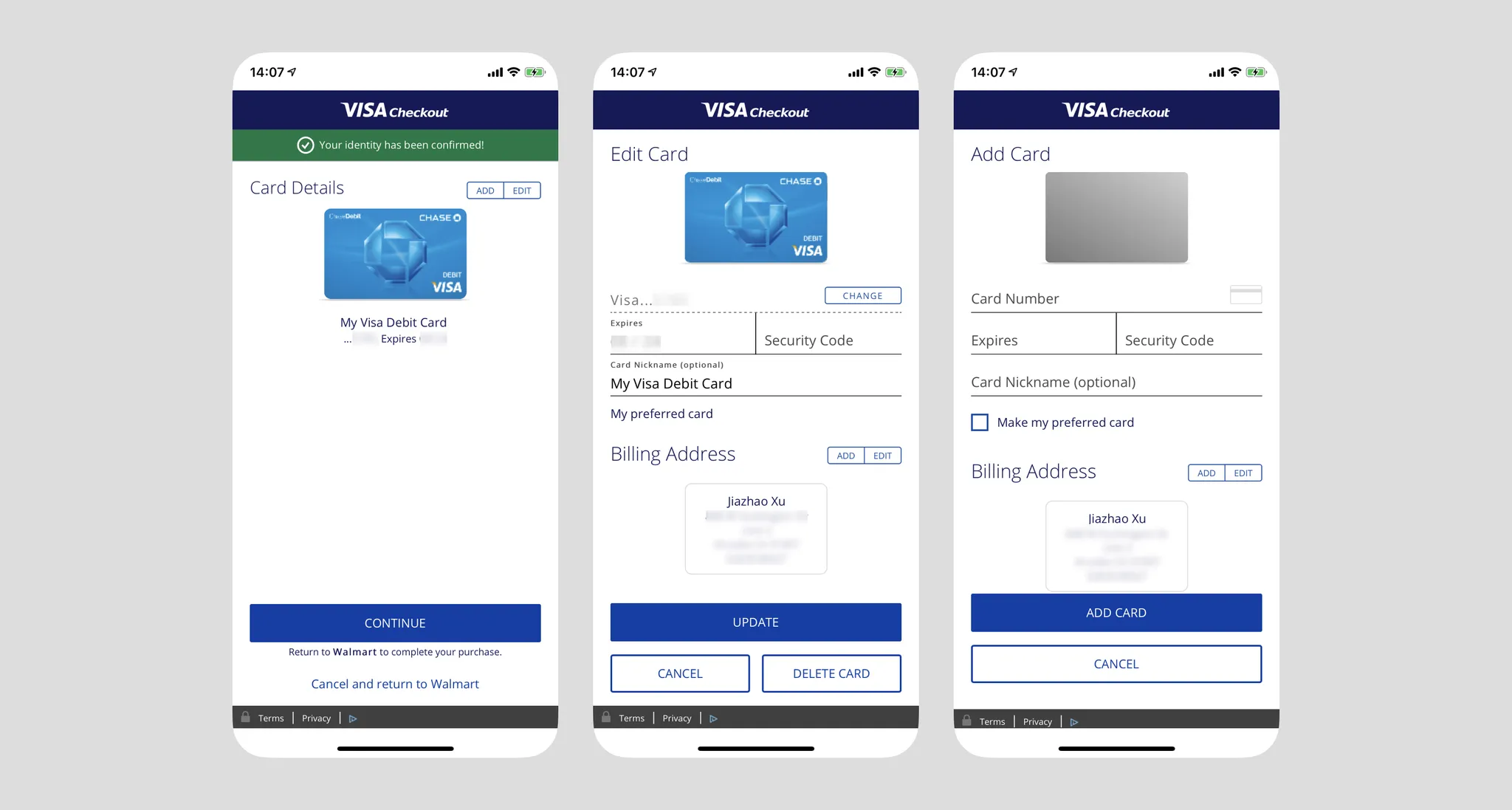
- After login, the user's bound cards are displayed directly. Tapping Continue at this point returns to Walmart to complete channel selection;
- Users can also edit or add cards. When adding a new card, Billing Address doesn't need to be re-entered — it defaults to the previously stored billing address;
- After returning to Walmart, it only shows "Card ending in ####," not indicating the user is using "VISA Checkout" service, unless the user edits the payment method again, at which point the two are displayed together;
- Note: VISA Checkout's web registration flow is quite streamlined: https://secure.checkout.visa.com/
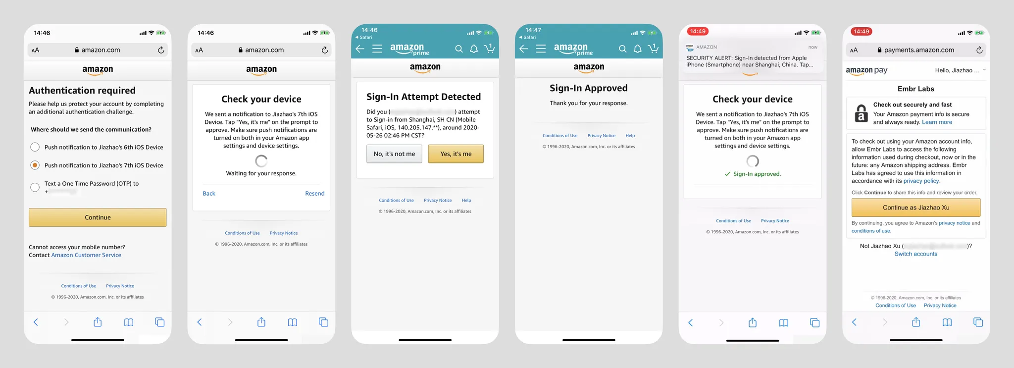
Amazon Pay on Shopify Site (New User)
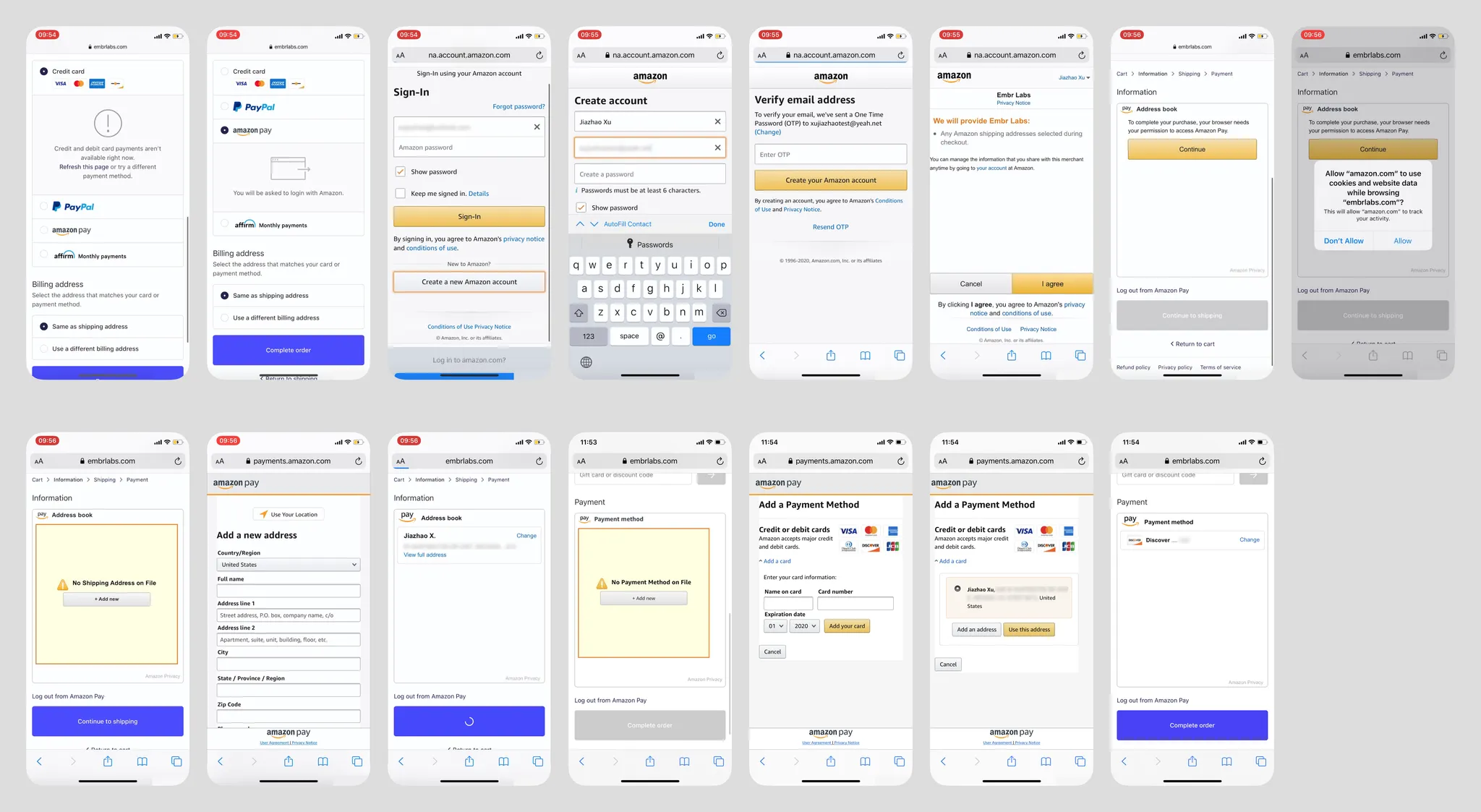
• Using Amazon Pay as a new user for payment is extremely complex (bouncing back and forth). I don't think a user without any Amazon account would voluntarily choose Amazon Pay. No detailed analysis here.
Amazon Pay on Shopify Site (Returning User)
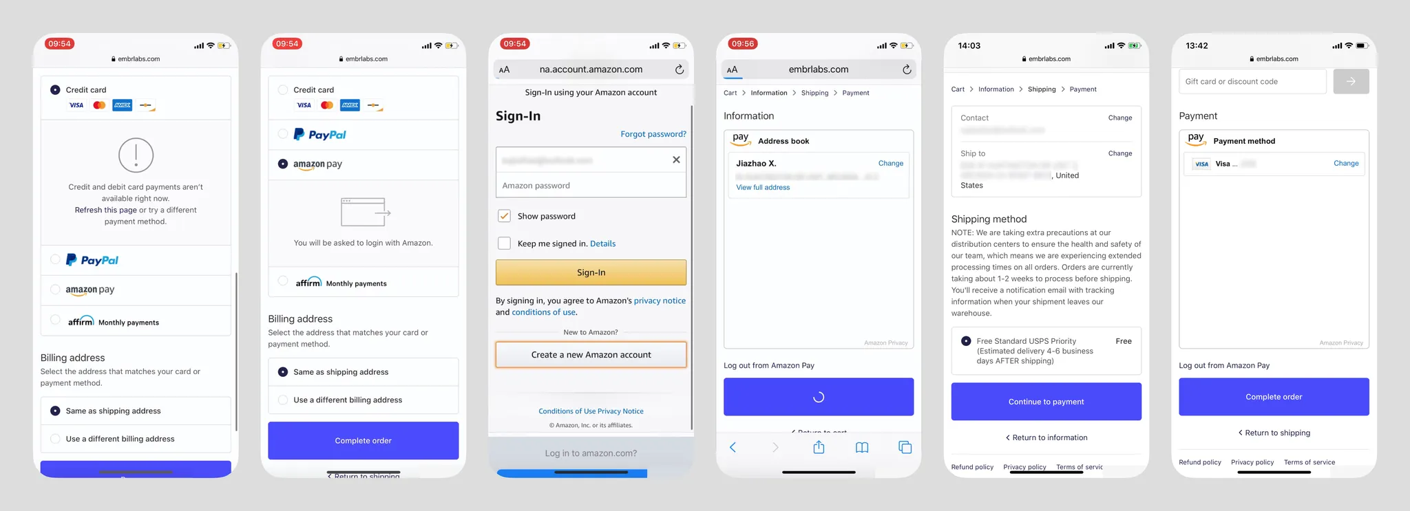
- On the login screen, the experience with Apple Keychain is excellent — the cursor automatically focuses on the email input, and Keychain auto-suggests saved account info below. One tap for auto-fill;
- Returning to the merchant page, the embedded Amazon Wallet window is very large and doesn't resize based on content. Shipping address and payment channel confirmation are handled on the merchant interface;
- UI elements under the Amazon ecosystem are very recognizable, but not attractive;
- Images below show additional security verification (triggered after login when the environment is insecure). Beyond SMS OTP, verification can be pushed to other mobile devices where the user has logged into the Amazon App (images 3 & 4) — this type of verification is uncommon. In image 2, Amazon App pushes a notification that users can tap to switch screens;
- After login, Amazon App also sends a login security alert.
Summary
I believe users still have a significant cognitive gap between browser shopping and in-app shopping, though the merchant-side implementation may be identical (Walmart App and Walmart.com share the same interface and interaction flow). During design, user security perception must be considered — frequent switching/jumping significantly impacts users' sense of security. If PayPal didn't have the annoying security verification, its overall flow would be the most ideal. However, its login screen doesn't activate Apple Keychain, requiring users to tap manually — a missed opportunity. Card addition is also a related step in these payment types and should reference the earlier section if needed.
In most cases, as long as users don't uninstall the App or clear browser cache, merchants can remember the user's bound payment methods for future use.
Particularly noteworthy: in Western markets, such services almost (99%) have no concept of a payment password.
Redirect Wallet Payment
GrabPay on Zalora
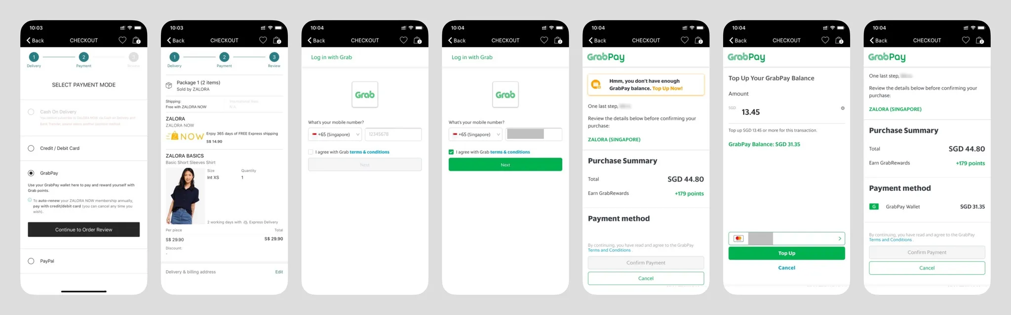
- Regardless of whether the user is new or returning, the login screen includes terms of service confirmation. Understandable if it's a legal requirement, but the extra tap feels redundant — can returning users skip it? "Next" presumably leads to new account registration for unrecognized phone numbers;
- At the top of the page, there's a temporary insufficient balance warning (but doesn't show the current account balance??), guiding users to top up. This screen also shows the payment amount and rewards;
- Payment channel can only select GrabPay balance??;
- Entering the top-up page shows top-up cards below, with the ability to edit them;
- Terms of service confirmation appears again above the payment confirmation — redundant;
- Returning to the merchant, the overall payment logic is very different from PayPal and VISA Checkout (I personally haven't even seen any similar scenario). In both of those, the payment node is at the merchant, with the channel merely bound to a single transaction. Zalora's payment node is in the GrabPay popup, a model more similar to mainland China's WeChat Pay and Alipay;
Google Pay on Instacart
Android prevents user screenshots
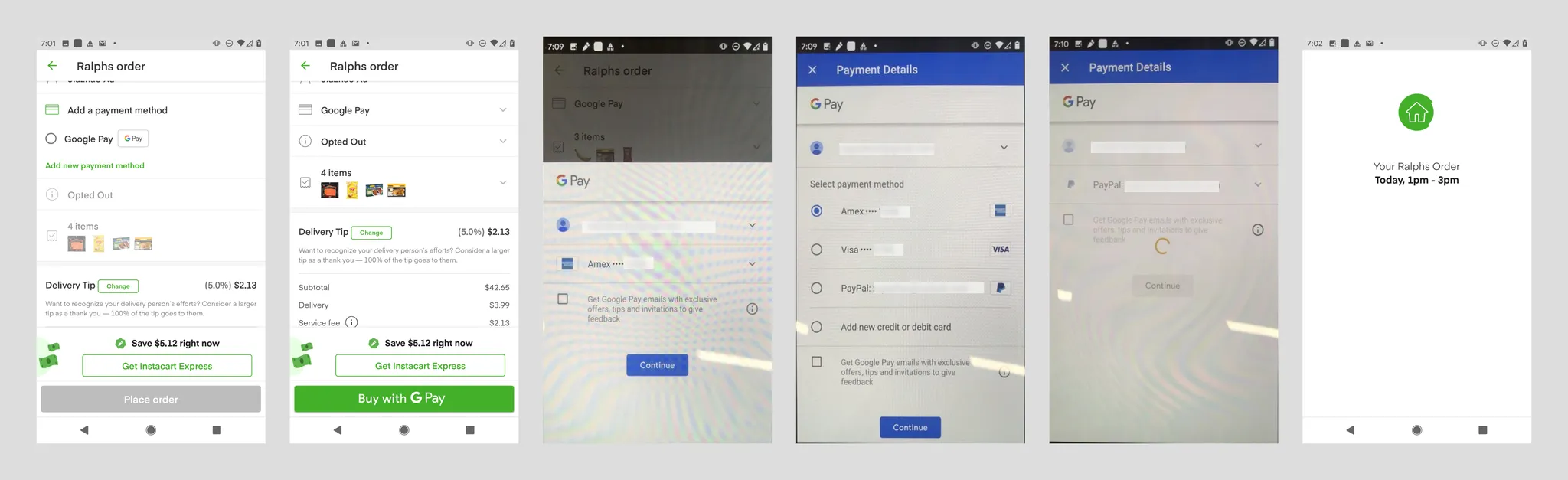
- Google Pay's branding is very prominent;
- Google doesn't support payment for users without a Google account. In North America, e-commerce users likely all have a Google account, and the account ID is pulled from the Android system;
- Payment channels within Google Pay include bank cards and PayPal. Users can also add bank cards. Google Pay backend can also bind bank settlement accounts, but this type of purchase doesn't support them;
- When adding a bank card, it automatically retrieves the user's name and billing address from the Google Pay account;
- If the user has a Google account but no Google Pay account, they're asked to add a bank card and billing address. Name is auto-retrieved from the Google account (editable), with a terms of service checkbox below (checked by default). This flow should be the smoothest new user conversion flow;
- Clicking "Continue" immediately places the order — quite unexpected, which forced me to submit a refund request. My understanding: since the merchant page already had "Buy with Google Pay" copy, this step just completes that action. Currently unsure if one-click ordering is possible with a single account/single card scenario;
- I'm currently unaware if newer Android devices offer faster user interaction flows.
Apple Pay on Doordash
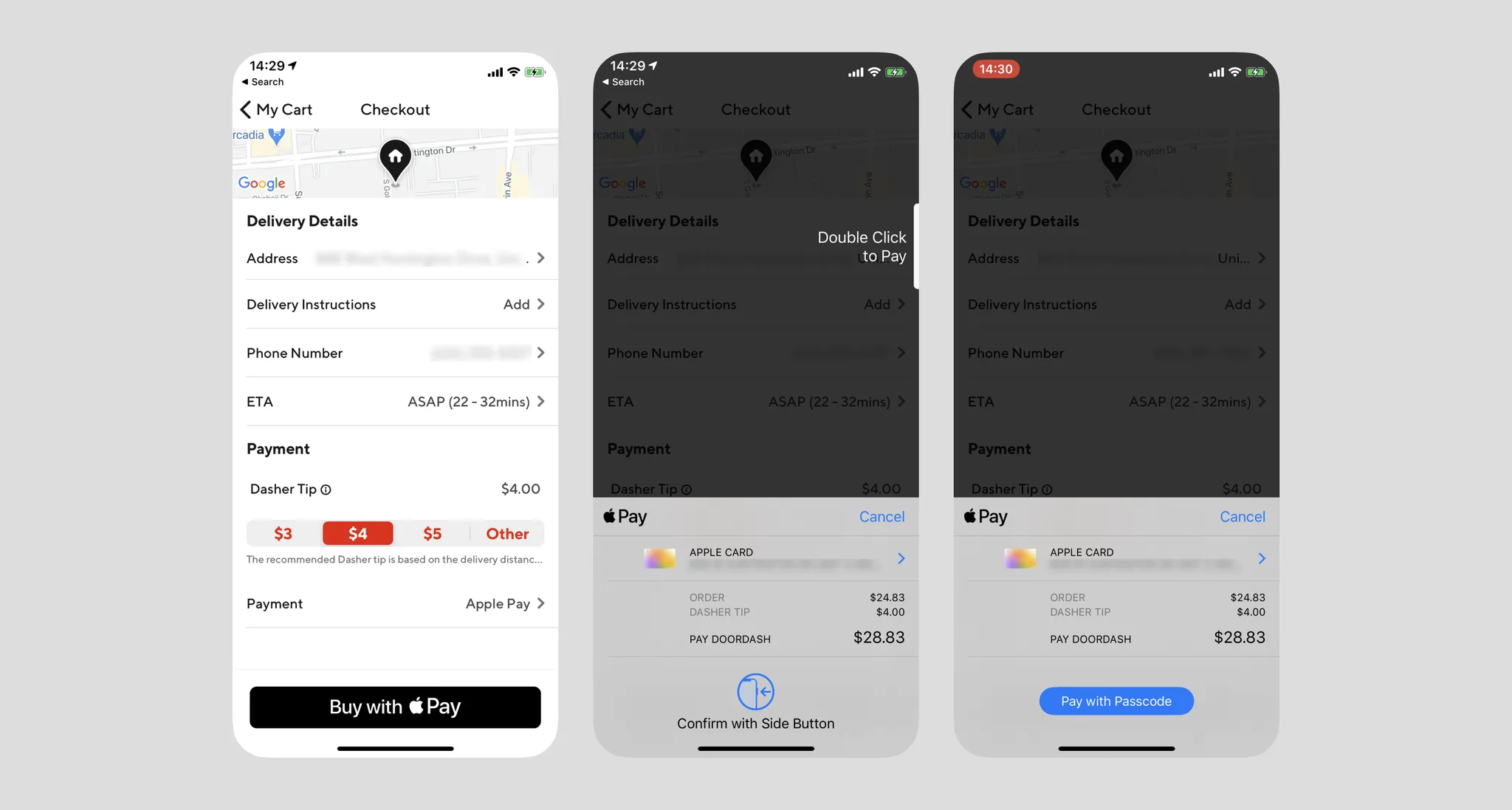
- Apple Pay's mobile interaction flow is unified, whether paying within Apple's ecosystem, outside of it, or offline;
- If the user's Apple Pay is configured, they can invoke the authentication page with one tap and pay using Face ID or Passcode. The page shows clear billing information — this is also the only payment flow I've used that invokes hardware;
- iOS 13.5 optimized for masks — it can now detect masks and shorten the ineffective face scanning time;
Summary
Apple leads the pack in payment experience by miles, but this is mainly due to its ability to integrate the operating system and hardware into the user interaction flow.
In terms of user cognition, it's unlikely users would categorize the three payment methods above together. GrabPay clearly invokes a new interface, while Google Pay gave users a degree of misdirection (which is why I accidentally placed an order). Apple Pay has very clear button copy, and with the merchant page preserved in the background layer reminding users they're still in the loop, the cognitive model is much clearer.
I've personally only seen redirect payments like GrabPay in mainland China and Southeast Asia.
BNPL
Klarna
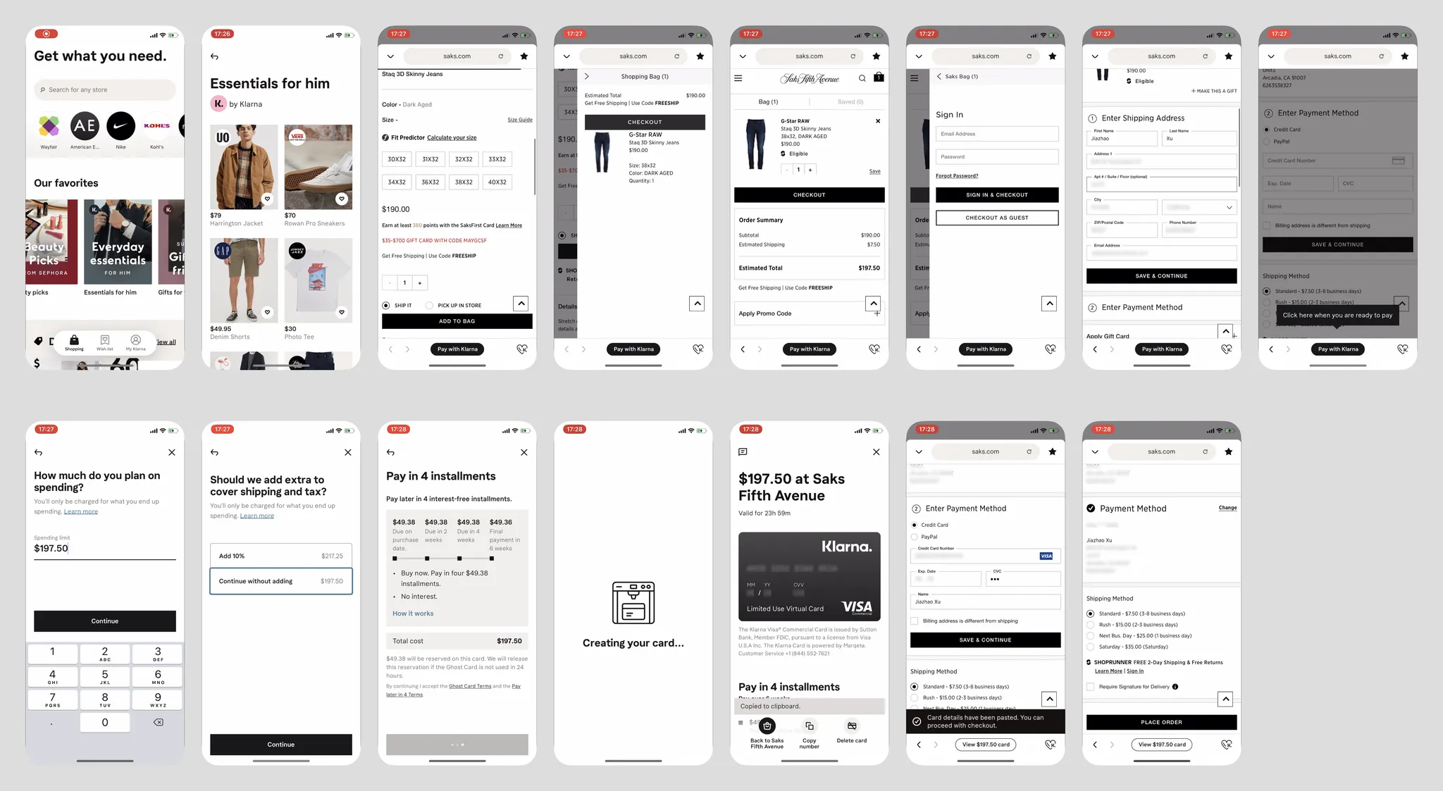
- Klarna is a Buy Now Pay Later service targeting Western markets. It integrates wallet, installment, and online shopping — a quite innovative business model for an online shopping tool;
- It has no e-commerce platform of its own — all content is scraped from the internet and served to users. Tapping a product in-app opens an embedded browser to the merchant's site, meaning users cannot shop cross-site, and Klarna has no built-in checkout;
- When the embedded browser reaches the checkout page, especially when payment info (bank card — reflecting Klarna's Western positioning) is needed, Klarna detects this and guides users to tap "Pay with Klarna." Klarna also auto-records the transaction price, reminding users that the price may not include tax and offering to add a 10% sales tax amount (though the highest sales tax in some US states is 10.25%);
- Klarna's model splits a single purchase into four installments over three weeks, creating a virtual credit card. The instant it's created, 1/4 of the amount is charged to the user's preset bank card — cool animation here;
- Returning to the merchant page, Klarna also auto-fills the virtual card info into the merchant's form, allowing the user to complete checkout;
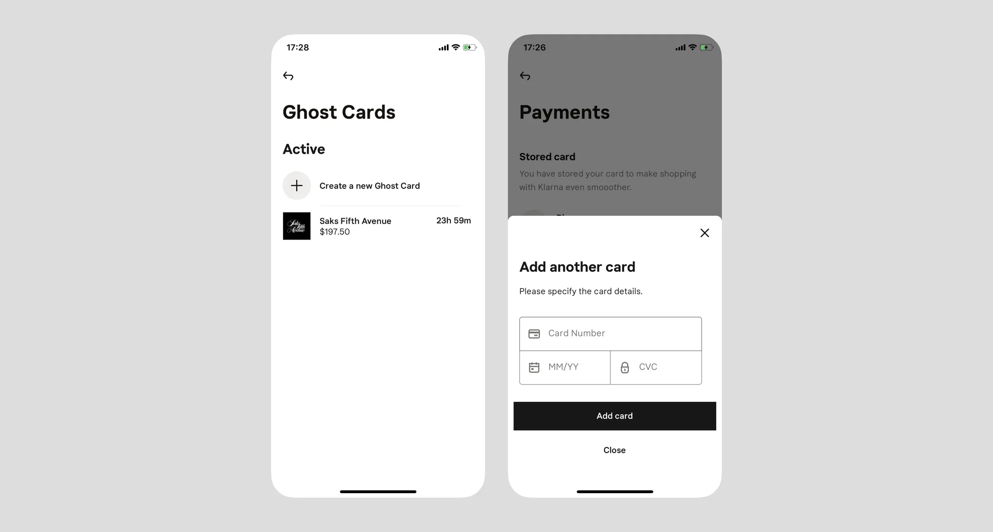
- Each purchase gets its own dedicated virtual card. Klarna's bank card addition interface is very simple (see image below).
- In the US, similar services like Affirm and Klarna are growing rapidly. Of course, spending ahead naturally fits Western consumer habits — Klarna is essentially nesting dolls: a virtual credit card wrapping a real credit card;
- Such services would be difficult to promote in developing regions;
- Overall, the experience is very unfriendly for first-time users, because the interaction flow has no existing reference or established habits. I had to watch YouTube videos to understand how Klarna works — the service itself even sounds like a scam;
- A consumerism trap!